

Q&A with Joe Fore | Law professor on the importance of how judicial decisions look

Across the vast federal court system are dozens of trial courts, 13 circuit courts of appeals and one Supreme Court. Each court issues countless pages of written work every year.
While the contents of judicial decisions may vary greatly, the look and feel of those decisions also lack uniformity.
Joe Fore, a professor of legal research and writing, has taken a different approach to analyzing court opinions. His interest lies in the formatting of judicial decisions and how style affects readability. Fore spoke with Colorado Politics about the most meaningful choices judges can make in laying out their decisions, and he reviewed the work of the Denver-based U.S. Court of Appeals for the 10th Circuit.
FAST FACTS:
- Joe Fore is a professor at the University Virginia School of Law, where he teaches legal research and writing
- Previously, he worked in private practice in Washington, D.C. and Florida
- Fore is on the board of directors of the nonprofit Legal Writing Institute
Colorado Politics: What led you to studying these circuit court opinions, not for their content but for their appearance?
Joe Fore: I’ve always been really interested in the visual appearance of writing. I think it’s an underappreciated aspect. I find it ironic, as someone who is a lawyer and a teacher of writing, that we spend so much time as writers on the substance of our writing – getting the words right, making sure things are clear, that the reader can understand them, that they’re persuasive. But when it comes to the last step of the writing process, getting words on the page and presenting them, it’s given so little thought.
Just its sheer legibility and how clear it is and how it can be understood by the reader, but also the impact it makes on the reader’s mind. When we present something to a reader, the visual impact reflects the care and the deliberateness somebody went through to make it. You don’t want to do anything that undermines it. And by having poor formatting, it can undermine all that hard work that you put into the substance.
CP: Certainly, federal circuit court opinions are the product of a lot of care and consideration. But from what you’ve seen, what makes certain circuit court opinions more readable, more attractive and ultimately a better experience for readers?
JF: One is sheer readability, legibility. What makes it easier to understand the text on the page and what’s being said? The main thing that seems to impact readability is spacing. Where text is in relation to each other, both in terms of spacing around the edges of the page with margins and then between and within lines.
One of the things that seems to impact readability a lot is making sure similar things are next to other similar things. Keeping paragraphs together, keeping lines close together, keeping words close together so a reader’s eye isn’t having trouble jumping from one line to the next or from one word to the next.
That’s where I think some of the problems pop up in judicial opinions. Random bits of white space within and between lines and paragraphs. Fonts can impact readability, but I think that’s exaggerated a little bit. Most fonts are pretty readable.
On the aesthetic side, I think the main principle here, and something that’s articulated in the Seventh Circuit’s “Suggestions for Typography” – one of the lines in there is something to the effect of, typographic choices should be deliberate. They are made for a reason because they communicate something.
If you are a court and you’re using a default font choice – “We’re gonna use Times New Roman, double spacing, size 12, because that’s how we’ve always done it” – if that’s your default, you’ve made a choice here. You’ve said, “I’m choosing to make this a normal document.” It’s a little strange to me that we have these circuit courts making these really influential and impactful decisions, and sometimes when you look at words on a page, it’s like something I would have had in a high school English paper.
CP: So if I hear what you’re saying, the typography, the layout and the font choices won’t make up for a circuit court telling a litigant that the cops who beat him up have qualified immunity and so he can’t bring a civil rights lawsuit. However, the choices in presenting that opinion can maybe make it a little more understandable to that litigant, outside of the words the court uses to describe his case.
JF: Not just with the litigants themselves, but for the broader civic function of the courts. Judicial opinions are interesting because they’re not necessarily trying to persuade. They’re trying to explain. It’s critical that they are easy to read. The public deserves transparency, the public deserves to know what’s going on. To the extent courts are using formatting that makes it harder to read or harder to understand, that’s a disservice to the public.
I think having opinions that reflect that they are the product of care and deliberation, that’s an important part of maintaining legitimacy. People are sharing these opinions a lot more on social media. Years ago, the layout of an opinion that a court releases may not have been as critical because who’s actually going to read this? Probably lawyers.
Now that I think more people in the public, and journalists, too, absolutely need to be able to read these quickly and understand what they’re saying, it seems to me it’s even more necessary.
CP: In front of us, we have a couple of 10th Circuit opinions. One is from Judge David Ebel, the other is by Judge Carolyn McHugh. They represent the typical look of an opinion coming out of the 10th Circuit. Each judge does it a little differently, but more or less, they mostly look like these. What is your opinion on the formatting? How do they compare with other circuits?

JF: They are sort of perfectly average! Times New Roman is a bit boring. In terms of readability though, I don’t think there’s anything hugely wrong with these opinions. I guess a slight advantage: They’re left-justified, they’re not fully-justified, which some people seem to think makes text more readable. The margins are a little bit small in size. The page numbers are a little bit close to the bottom of the text.
One thing I think I see in common when I look at the circuits most people seem to like, including the U.S. Supreme Court: They’re not doubled-spaced. They’re single spaced. Which, I think, makes for an easier reading experience. I don’t feel bad encouraging courts to do better because I don’t think we’re asking a lot. I don’t think it’s a big ask to just improve a template.
You said this is pretty indicative of the 10th Circuit. That’s another small problem. You’ve got intracircuit differences. From a communicative standpoint, that’s a potential problem if you are a circuit and you’re trying to convey, “We are a singular circuit and we are announcing the law of the circuit.” Please just be consistent!
CP: Let’s look at the Bacharach opinion, which is actually two opinions. It’s the majority opinion by Judge Robert Bacharach, who has authored a book about judicial writing styles, and the dissent by Judge Timothy Tymkovich. Not only does the Bacharach opinion look different, but he employs a lot of bullet points and numbering and full sentences for section headers. What do you make of that?

JF: The things you mentioned about bullet points, heading formatting – to me those are more substantive writing choices and I think those are all good. I highly recommend all of those. I think Judge Bacharach did a great job. I actually have Judge Bacharach’s book behind me on my credenza!
The one thing that jumps out at me though, something looks off. The spacing of the letters is different. This is a great example, and a very striking one, of not only internal consistency within the court but within the same document. To me, it’s a bit of a jarring experience to go to the end of Judge Bacharach’s opinion and then flipping over to read the dissent. It’s like, “Whoa, am I reading the same case?” It almost looks like a mistake.
To me, it’s actually less readable, which is ironic because I’m a huge fan of Judge Bacharach’s book and his writing. The writing is terrific and the substance of it is very good, whether it’s the headings or the bullet points or all that. But just when I first looked at the page, something about the spacing made it a little tough for me to follow the words. They seemed a little stretched out to me. I had to do a little more work to jump from one word to the next and one line to the next.
Editor’s note: Fore later clarified the character spacing in the Bacharach opinion was expanded, which created the difference.
CP: Switching to two state court opinions – the Colorado Supreme Court and Court of Appeals – they look different from each other, but inside the courts themselves, the opinions are very much similar. There are not nearly as many stylistic differences as in the federal courts. Do you have any comments on the readability of each?


JF: They both have their pros and cons. One thing I do love about both, I love the paragraph numbers. I wish everybody would do that!
The Court of Appeals’ text is larger. If you’re reading it on a screen you can zoom in, zoom out. But it does take up a lot of space on the page, so you’re not getting as many words per line.
The Supreme Court looks slightly more dense. You’re fitting a few more words on a line. One thing you do notice: On the Supreme Court, they do have the full-justified text. My brain was having a little confusion because I wasn’t sure if we were going to another line that was in the same paragraph or, “Oh, actually we’re starting a new paragraph.”
Because this is double-spaced, the paragraphs aren’t as cohesive. It looks like one big wall of text. It’s all line-space-line-space. Some other courts, their text might be single-spaced and they’ll put two spaces between paragraphs. Here, it’s a little hard for the brain to break apart paragraph to paragraph.
The Court of Appeals is actually a little bit easier because it’s left-aligned. It’s easier to see when the text ends.
CP: So what you’re saying is it’s OK for appellate courts to have different looking opinions from each other, but it’s really important they all communicate the same style within the court?
JF: It’s certainly more important that each court is internally consistent. It’s also important a journalist or professor or lawyer or member of the public can see a document and recognize, “Oh, this looks like a Fifth Circuit opinion or a Colorado Supreme Court opinion.” I don’t have questions about authenticity.
There’s maybe a little irony that the circuits strive for so much consistency in substantive law. They go out of their way trying to avoid creating circuit splits on the substance of the law. It is interesting that they’re so different in their formatting choices.
I know there are much bigger problems in the world. There are challenges to legitimacy and the substance of judicial rulings. But they do put a lot of care and work into their writing, and they and the public deserve that final product to look as good as all of the care and the work that went into the substance.

Susan Blanco signals views on role of appellate courts in first opinion as Colorado justice
Michael Karlik
michael.karlik@coloradopolitics.com
Updated 39 seconds ago
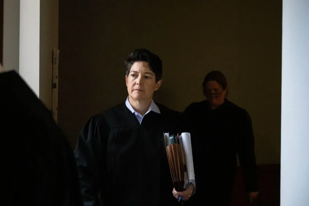
Justice Susan Blanco’s first solo opinion as a new member of the Colorado Supreme Court made clear her view of the guardrails that keep the state’s highest court tethered to the issues it is asked to decide. On Monday, the...
Colorado leaders weigh next steps after Supreme Court rejects state ban on ‘conversion therapy’
Marissa Ventrelli
marissa.ventrelli@coloradopolitics.com
Updated 17 hours ago
Colorado leaders said they are weighing next steps after the U.S. Supreme Court on Tuesday rejected the state’s ban on “conversion therapy” for children, as critics and supporters cheered or lambasted the ruling. The court’s near-unanimous decision called the Colorado...

Federal judge dismisses U.S. government lawsuit against Colorado, Denver’s ‘sanctuary’ laws
Michael Karlik
michael.karlik@coloradopolitics.com
Updated 16 hours ago
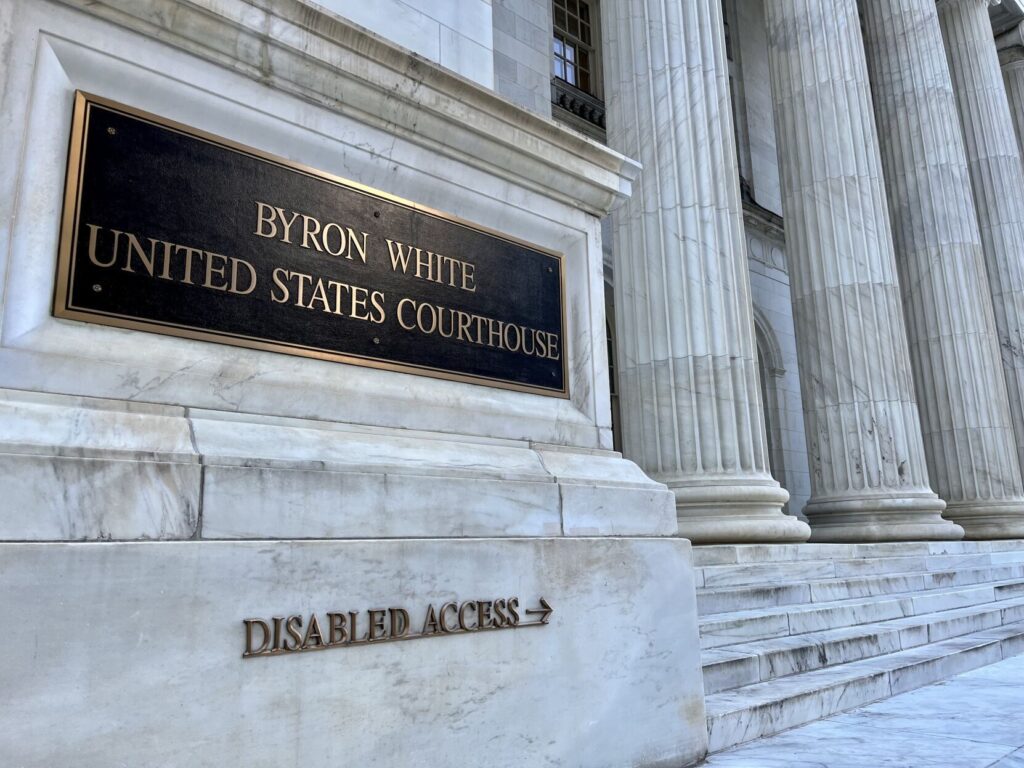
A federal judge dismissed the U.S. government’s lawsuit against Colorado and Denver on Tuesday, which alleged that various local policies impermissibly infringed on federal immigration enforcement. U.S. District Court Judge Gordon P. Gallagher followed the lead of judges in Illinois...
Federal judge finds DOJ adequately searched for, disclosed records related to Bidens
Michael Karlik
michael.karlik@coloradopolitics.com
Updated 21 hours ago
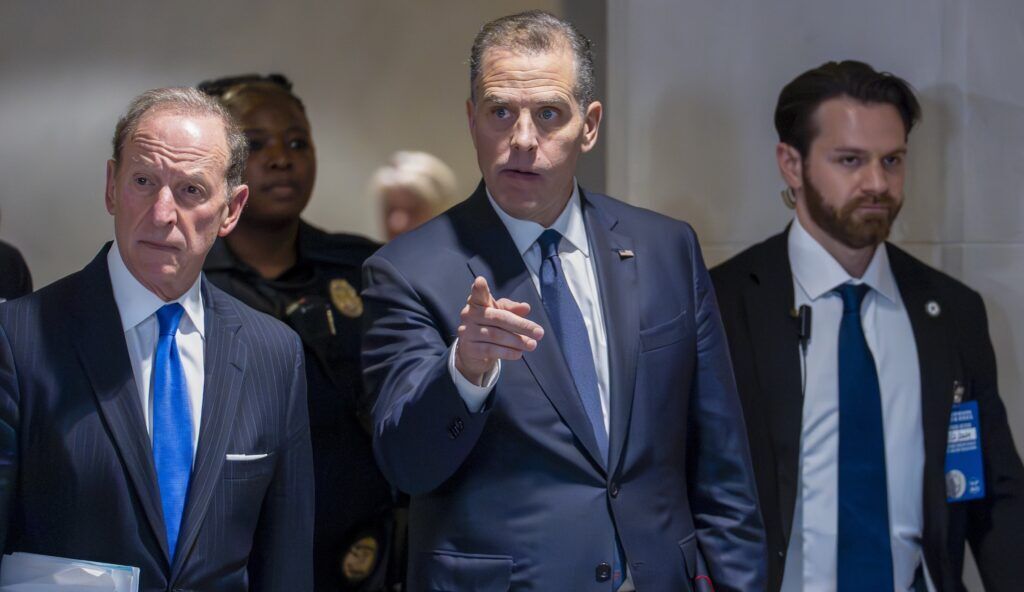
A federal judge determined on Friday that the U.S. Department of Justice adequately searched for and disclosed records to a Colorado attorney in response to his request for documents related to former President Joe Biden’s son and brother. In November...
10th Circuit warns lawyers after finding fake case in filing
Michael Karlik
michael.karlik@coloradopolitics.com
Updated 15 hours ago
The Denver-based federal appeals court warned attorneys to be more careful last month after discovering one lawyer cited a fake case in his arguments. In recent months, federal and state judges in Colorado have begun cautioning lawyers explicitly about the...

10th Circuit rules cognitively impaired man’s risk of lobotomy, mistreatment in Mexico not ‘torture’
Michael Karlik
michael.karlik@coloradopolitics.com
Updated 2 days ago
The Denver-based federal appeals court concluded last month that a man’s risk of mistreatment or forced lobotomy in his native Mexico did not amount to “torture” that should shield him from deportation. A three-judge panel of the U.S. Court of...
Colorado justices side with news organizations for disclosure of high-level child abuse data
Michael Karlik
michael.karlik@coloradopolitics.com
Updated 18 hours ago
The Colorado Supreme Court ruled on Monday that the state must disclose the number of child abuse reports at individual group living facilities in response to an open records request, as the addresses are already in the public domain. The...
Divided Colorado Supreme Court finds Denver detective did not violate defendant’s Miranda rights
Michael Karlik
michael.karlik@coloradopolitics.com
Updated 2 days ago
The Colorado Supreme Court determined on Monday that a Denver detective did not improperly resume questioning of a defendant in custody after he invoked his right to counsel. By 4-3, the justices reversed a trial judge’s order that found a...

Out-of-state judges address ex-discipline director’s lawsuit, Colorado justices accept federal invitation | COURT CRAWL
Michael Karlik
michael.karlik@coloradopolitics.com
Updated 2 days ago
Welcome to Court Crawl, Colorado Politics’ roundup of news from the third branch of government. A pair of out-of-state judges got down to business in a lawsuit brought by Colorado’s former judicial discipline director, plus the state Supreme Court has...
Federal judge upholds constitutionality of Colorado campaign contribution limits
Michael Karlik
michael.karlik@coloradopolitics.com
Updated 5 days ago
A federal judge upheld Colorado’s individual campaign contribution limits as constitutional on Thursday, finding that three Republican plaintiffs failed to prove the campaign finance framework violates their First Amendment rights. U.S. District Court Senior Judge John L. Kane recognized that...
PREV
PREVIOUS

A 1,200-year-old idea flows through Costilla County; three cities, three homeless strategies | WHAT YOU NEED TO KNOW
Today is Oct. 23, 2023, and here’s what you need to know: In San Luis, and the small towns that surround it, water rights are held by ditches that were built before Colorado became a state – and under a concept that seems almost foreign to the rest of the West, which lives on the […]

Colorado Supreme Court reins in Arapahoe County judge who set early deadline for DUI test results
An Arapahoe County judge had no authority to penalize the prosecution when the state lab did not provide blood test results in a drunk driving case as soon as he wanted it to, the Colorado Supreme Court ruled on Monday. The 18th Judicial District Attorney’s Office petitioned the justices directly after County Court Judge J. […]